The observant among you will have noticed the soft debut of the new logo for Warnborough Worldwide. For the longest time, we have used a world with the two shields of Warnborough College (UK) and Warnborough College (Ireland).
We decided to “upgrade” the logo to something a bit more contemporary but which still retained plenty of meaning. Let’s look at it in greater detail.
The W symbol

This W was chosen because it looks like two Ws superimposed over each other. Symbolically, it represents the infinity symbol, as well as the helix (the base form of DNA – building blocks of the world). Each action we do serves to inform and grow the next one. We learn from mistakes because learning is never-ending. This W represents the building blocks of the Warnborough ‘brand’ in all its forms. The ‘W’ symbol is versatile enough so that if you flip it the other way, it forms a double ‘A’ – just perfect for our Warnborough Worldwide Alumni Association (WWAA) – see below.
The Wheel

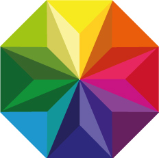
The shape of an octagon is meaningful in many cultures – in the West, it is symbolic of renewal or eternal life; in the East, it is considered to be auspicious and luck-bearing. Navigationally, each point is one of the four cardinal directions with their four intermediate points. This brings the ‘worldwide’ angle in – replacing the ‘globe’ of previous incarnations. The colour ‘wheel’ shows the different colours and shades of the world, ending with the rising of the sun at the top. Like a rainbow, it also shows that Warnborough is all-inclusive and non-discriminatory to people of any gender, race, religion, orientation, etc. The diamond-features inside the wheel show that we are multi-faceted in our approach.
Use of the Logo
We can pair the logo with our different brands and over the course of the coming months, you will see this logo used within the wider ‘Warnborough’ community. Here are some ‘examples’:


